Halftones
Square Dot
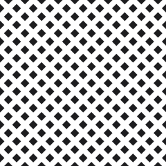
A square dot is a halftone dot with hard corners that meet on all four sides at exactly 50%, producing a crisp but abrupt midtone break.
A square dot fills its cell corner to corner, so at exactly 50% every square touches all four neighbors at once and the image flips to a checkerboard in a single step. Under 50% the squares are isolated ink islands; over 50% the geometry inverts and the unprinted squares close to nothing near 90%. The corners are the whole argument. A 90-degree corner holds an edge that a circle rounds off, which is why the shape at 20 to 45 lpi reads as deliberate texture instead of as a photograph — at 25 lpi each dot spans about forty thousandths of an inch, visible across a room.
That visibility is usually the commission. A square dot job tends to be a design decision: a band tee where the giant mechanical dots are the artwork, a comic-panel look at 20 lpi, a two-color print built on coarse texture over a fashion-gray blank. Buyers ordering it should expect to count the dots from ten feet away.
Printers spec square dots for graphic effect, for gradients that live entirely above or below the 50% break, and for jobs where the softness of an index print feels wrong. The trade-off comes in the highlights: on 305 mesh with a thin 10-micron stencil, the corners of a 5% square are the first thing to blow out in the washout tank, so detail disappears earlier than it would with a round dot.
The misconception is that a sharper dot yields a sharper print. Crispness on a shirt comes from mesh count, 35 to 45 N/cm tension, off-contact, and stencil thickness — not from corners, which ink spread rounds off anyway within the first few dozen impressions. Pick the square dot because the look demands it, never as a repair for a soft-printing press.