Halftones
Index Print
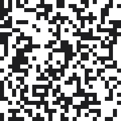
Index print separations replace halftone dots with a grid of equal-size square pixels placed randomly, one screen per flat color, eliminating screen angles, LPI, and moire.
An index print carries no halftone dots at all. Artwork gets reduced to a fixed palette, typically 6 to 12 colors, then rendered as a grid of identical square pixels scattered by a diffusion dither, so tone comes from how many squares of each color land in an area and never from their size. In Photoshop the path is Image > Mode > Indexed Color, Local Selective palette, Diffusion dither at 100%, followed by a Nearest Neighbor resize until each pixel measures roughly 0.020 to 0.025 inch. Every palette color gets its own screen. No angle, no LPI, nothing to beat against the mesh.
For a buyer, an index print is the answer when halftones keep going sideways. Bright art on dark garments, meaning cartoon characters, tattoo-style illustration, anything with flat saturated color, prints hard and clean because each screen lays solid ink instead of shrinking dots. We moved a repeating 8-color job to index after two runs came off 195 mesh with moire through the sky, and the third run went down without a single argument about angles.
Pros match pixel size to mesh, not to the file. A 0.020-inch pixel spans about five threads on 230 mesh and prints all day; halve it and you are back to holding halftone-scale detail with none of the payoff. Screen count is the trade: an index print of a photograph may want 9 or 10 screens where simulated process handles the same image in 6, and long soft gradients look grainy because the palette really is that limited.
The myth is that indexing cannot do gradients. Diffusion dithering blends adjacent palette colors well enough to fake a ramp. What it cannot do is photographic subtlety, since 10 flat colors will not cover the couple hundred tones a human face needs. Index for illustration, simulated process for photographs.