Halftones
Duotone
A duotone is one photograph separated onto two halftone screens, two inks at two angles, for depth and a color cast a single gray screen cannot reach.
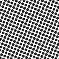
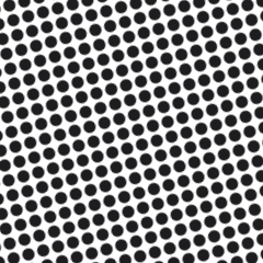
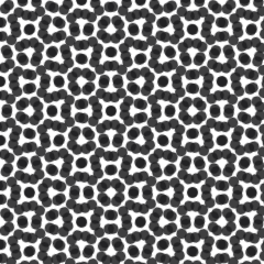
A duotone splits one photograph across two halftone screens, each carrying its own tone curve, printed in two inks at two angles. Keep those angles 30 degrees apart, 45 and 75 being the standard pairing, because anything nearer 15 degrees drops the two dot grids into moire. One ink usually carries the full scale including shadows, while the second is curved to live in the midtones and highlights, adding density and color exactly where the first ink runs thin. Two screens never build a rosette; the pattern is a plain crosshatch.
What a customer buys with that second screen is warmth and depth. Black plus a warm gray for a vintage photographic look, black plus PMS 877 silver on a dark tee, navy plus pale blue on a stadium shot so the sky separates from the crowd. A duotone reads as a deliberate design choice rather than a photo dropped onto a shirt, and the added cost is one screen, one setup, and some registration attention, which is nothing next to a four-color job.
Build it in Photoshop under Image, Mode, Duotone, shape each ink curve, then convert to multichannel and pull the channels as separate positives. Print the lighter ink first and the darker second so the dark dots stay crisp on top. Registration tolerance is roughly 1/64 inch before the grids start to fight each other. The trade-off is that two inks still cannot reach a true color photograph; this is a tint, not a palette.
The frequent mix-up is calling a grayscale photo printed in brown ink a duotone. That is a monotone, one screen in a colored ink. The real thing demands two separations from the same image, curved differently, or the second screen adds cost and nothing else.